CS4
/ CASE STUDYFlint Design System Foundations
Validating the architecture and standards of a multi-brand, cross-platform design system with a strategic pilot program.
Bonfire at a Crossroads
Bonfire is Spark’s unified platform designed to bring their portfolio of brands under one scalable front end. Their design system Flint needed to support that vision, enabling consistency across brands and platforms while enabling speedy delivery with full alignment between design and development. An early system had been created with agency support, offering basic tokens and components, but it lacked the structure to scale or keep design and code in sync.
My Role
I was brought in as Design Systems Lead to evaluate Flint’s preliminary state and chart a path forward. Rather than jumping into execution, I took a strategic approach, reframing the challenge as foundational validation, not just delivery. I led a pilot program to validate multi-brand theming, cross-platform token delivery, and design–development workflows. My work included establishing the token architecture, facilitating cross-functional alignment, and codifying a methodology to support adoption as the system evolves. This case study traces that validation journey from approach to implementation.
“The faster we make our ideas tangible, the sooner we will be able to evaluate them, refine them, and zero in on the best solution.”
The Case for a Pilot
I began by reviewing the existing system through two audits: 1) design tokens and 2) the component library in Figma. These surfaced gaps and opportunities for greater consistency, scalability, and alignment with engineering. The findings became the baseline for the pilot program, clarifying what worked, what needed refinement, and what issues Flint would need to address. Having concrete evidence informed the architectural decisions that followed.

A Deliberate Scope
To facilitate the transition to next-generation Flint, a pilot program would offer a low-risk way to validate fundamentals under real conditions. The intent was to build a small part of the actual puzzle, not a demo. Keeping the scope small but deliberate allowed us to move forward with purpose, and position Flint for broad adoption. The work was defined by:
A scoped set of components: buttons, toasts, chips, modals.
Powered by the new token architecture, with multi-brand theming built in.
Infrastructure in place: token pipelines, versioning, Storybook documentation.
Production standards established through design/code parity and early adoption.
The resulting pilot program established baseline standards and the conditions for cross-functional teams to adopt components incrementally and test hybrid use¹ (Flint alongside legacy) as Flint moved toward Beta. It also helped onboard Spark’s engineering team into design system practices, giving them hands-on experience with naming standards, multi-brand theming, and component API.
- The beta phase will test Flint and legacy components running side by side to ensure runtime support for both Flint and pre-Flint tokens while validating performance under live conditions.

Laying the Groundwork
The point of this phase wasn’t just about proving Flint could work; it was about showing teams what working with a real design system feels like. Each outcome built confidence in a different way.
Building Core Components, Together
The pilot centered on a small but meaningful set of components – buttons, chips, toasts, modals – designed and developed through structured cross-functional collaboration. I facilitated weekly alignment workshops with the engineering team to collectively set standards for token naming, component properties, and API documentation. With Code Connect implemented directly in pilot components, design and engineering worked against the same source of truth instead of relying on manual inspection of specs.
To keep the work organized, I introduced a versioning model where each component carried its own release path, enabling incremental adoption without waiting for full releases. I also built a Confluence database that served as our component tracker, linking related Jira epics, Storybook documentation, and deep Figma references with support for filtering by phase, status, and dependencies. Together, these processes and tools formed the operational backbone that carried Flint from pilot into production.
Why it matters: this was the first time Flint components were experienced as “real”, built through close design–engineering collaboration and supported by infrastructure designed to scale with the system.


Tokens and Theming at Work
Early on, I established Tokens Studio as our single source of truth for design tokens, leveraging its signature capabilities: multi-dimensional theming, color modifiers, calculated values, and GitLab integration. The challenge was translating this robust output into Figma’s limited variable model. I designed the architecture to ensure advanced tokens for responsive dimensions, surface theming, and parametric typography resolved cleanly into design files. This allowed designers to switch between brands and themes without dealing with the complex token logic underneath.
To stress-test the architecture, I then worked on a Style Dictionary pipeline that achieves complete brand isolation² at the output level while maintaining shared logic at the architecture level. With AI assistance, I explored transformation scripts for web output to test support for brand themes, color modes, surface contexts, and responsive dimensions. This validated the approach and provided a reference for future implementation on iOS and Android.
Why it matters: this architecture solves the fundamental multi-brand design system challenge of scaling shared functionality while preserving brand expression. This stage of the pilot proved that the complex theming setup worked reliably.
- I used brand-prefixed granular tokens to provide brands room for self-expression. Then Style Dictionary transforms and filters isolated those tokens per brand, so outputs stayed clean and optimized.
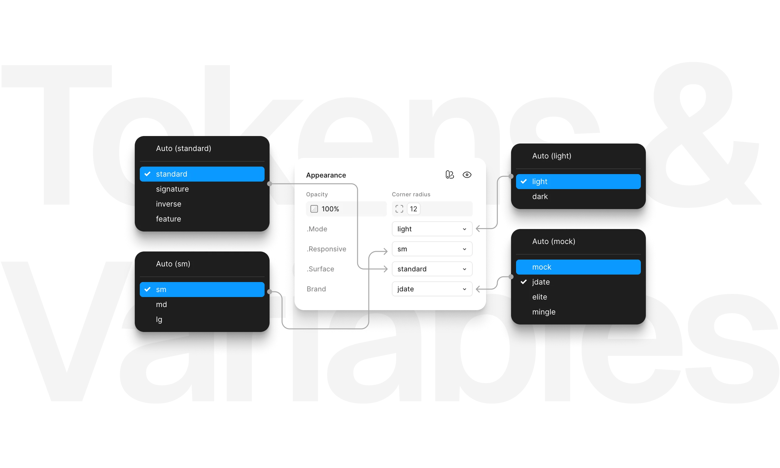
The token architecture supported multi-dimensional theming in JSON and exported to Figma as modes; light/dark, responsive dimensions, surface contexts, and the brand layer all working together.
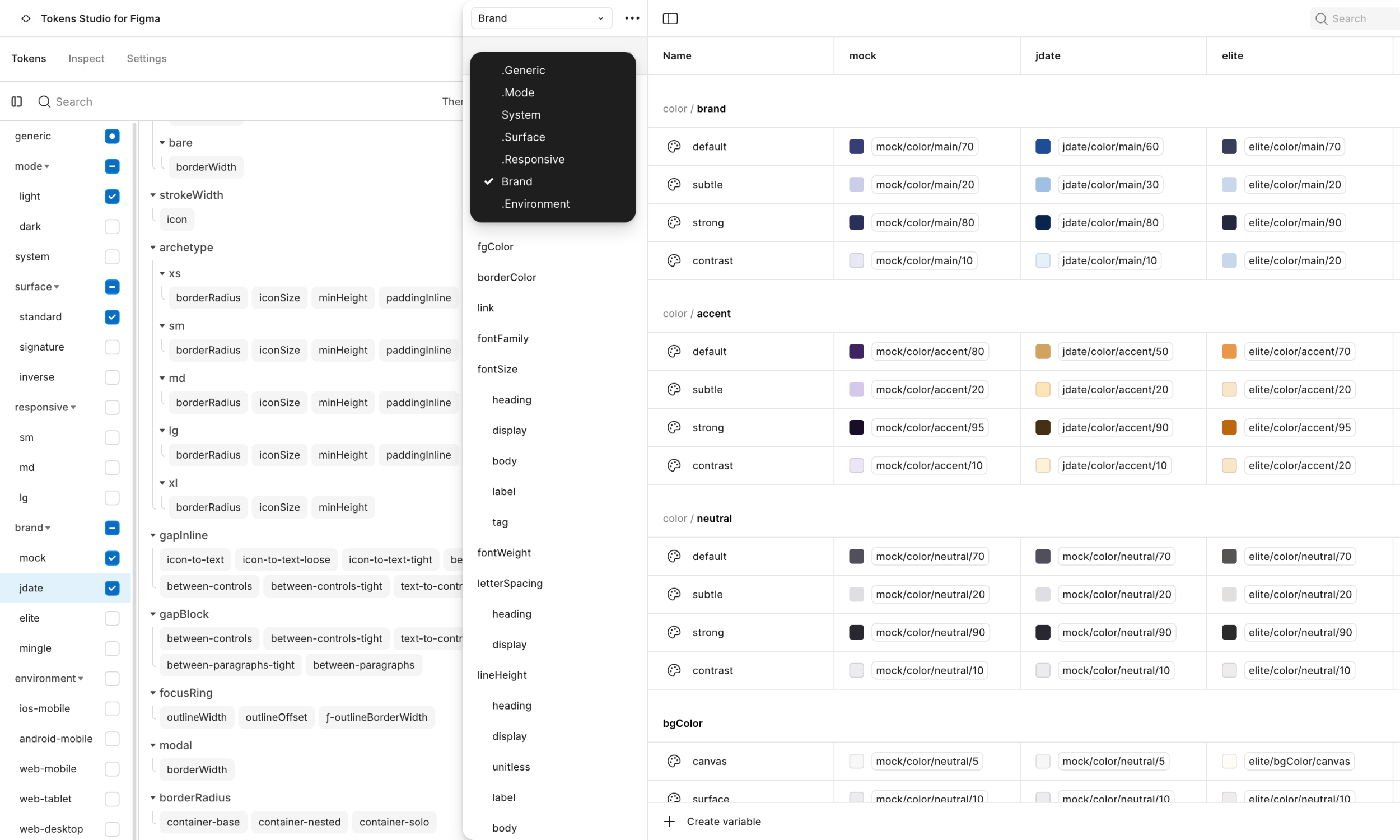
Complex tokens and themes properly exported as Figma variables, with collections named and categorized to expose only what designers need.
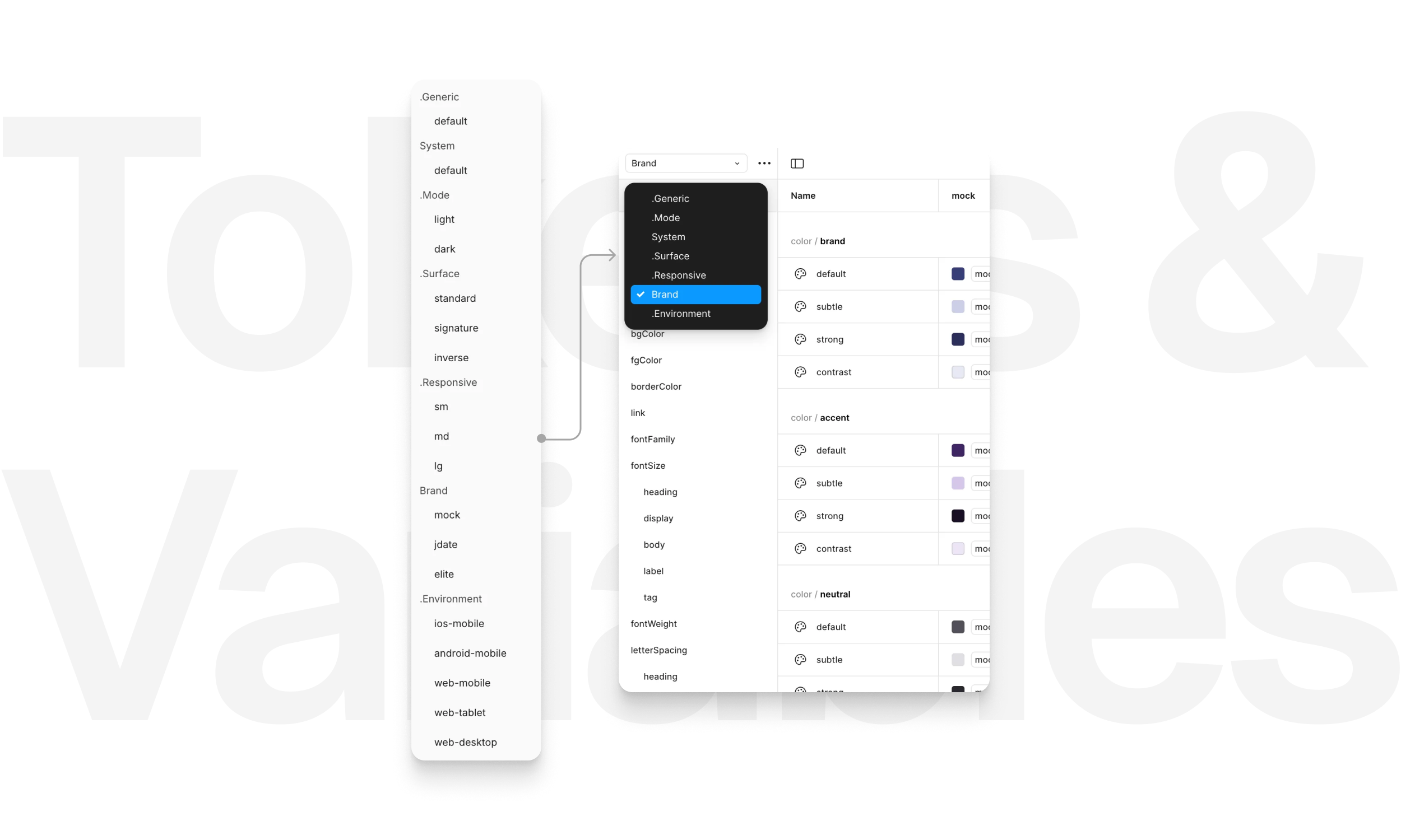
Certain themes were named with a period prefix in Tokens Studio to exclude them from being published to team libraries, ensuring only the intended collections were available for designers to use.
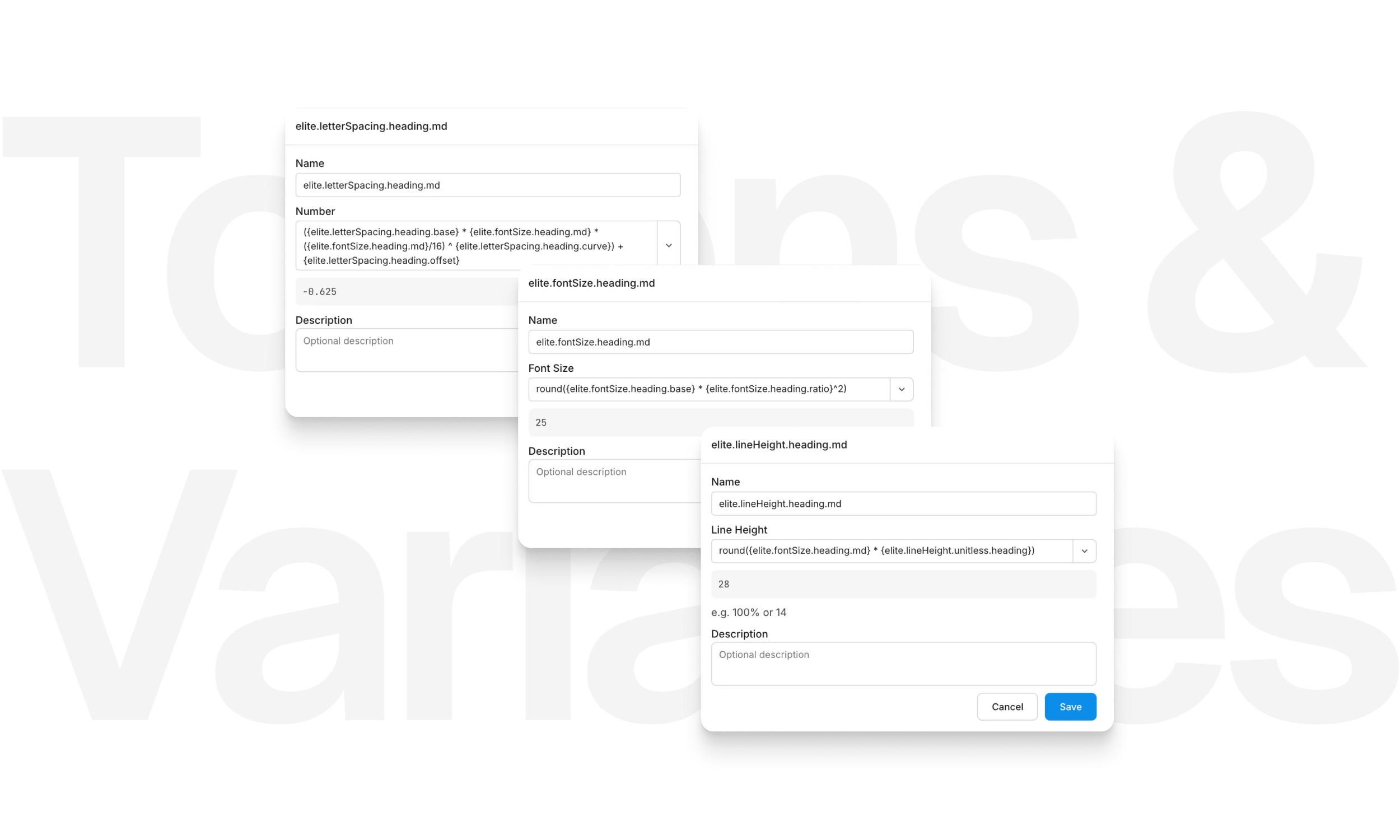
Advanced tokens used parametric typography calculations and color modifiers to deliver predictable type scales and consistent color variations across themes and contexts.
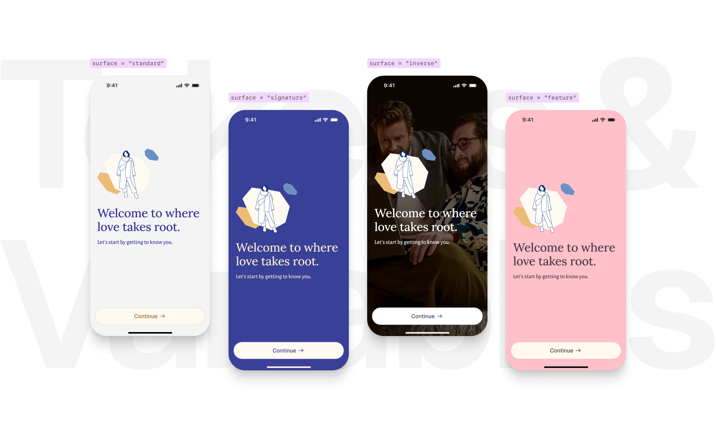
Content colors adapting to their background, with surface context as its own theming dimension independent of light/dark mode. The “feature” surface was intended for seasonal colors, like Valentine’s Day.
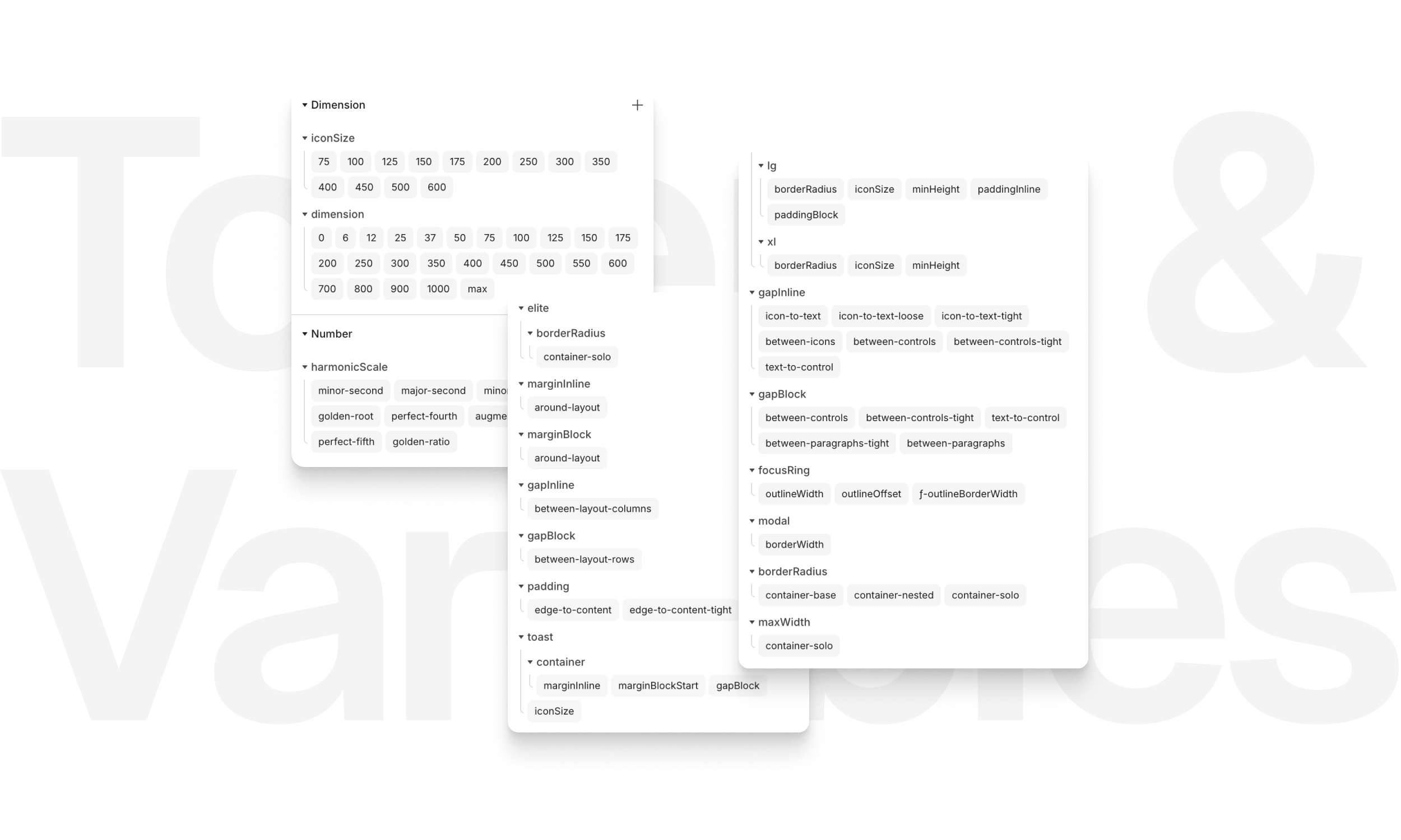
Primitive scales stayed at the primitive layer, while true semantic tokens captured meaning through roles and usage, not just numbers.
A Better Environment for Designers
Not every improvement tied directly to the pilot’s architecture. Some were side efforts aimed at giving the design team a cleaner, more efficient environment to work in, laying foundations that would pay off as Flint matured.
Library and feature file overhaul: legacy files were restructured, renamed, and optimized for clarity and speed, with seamless linkage across brands and platforms.
Content automation (WIP): a proof of concept delivered brand-specific content directly into design files from Google Docs, eliminating manual copy/paste and making updates quicker.
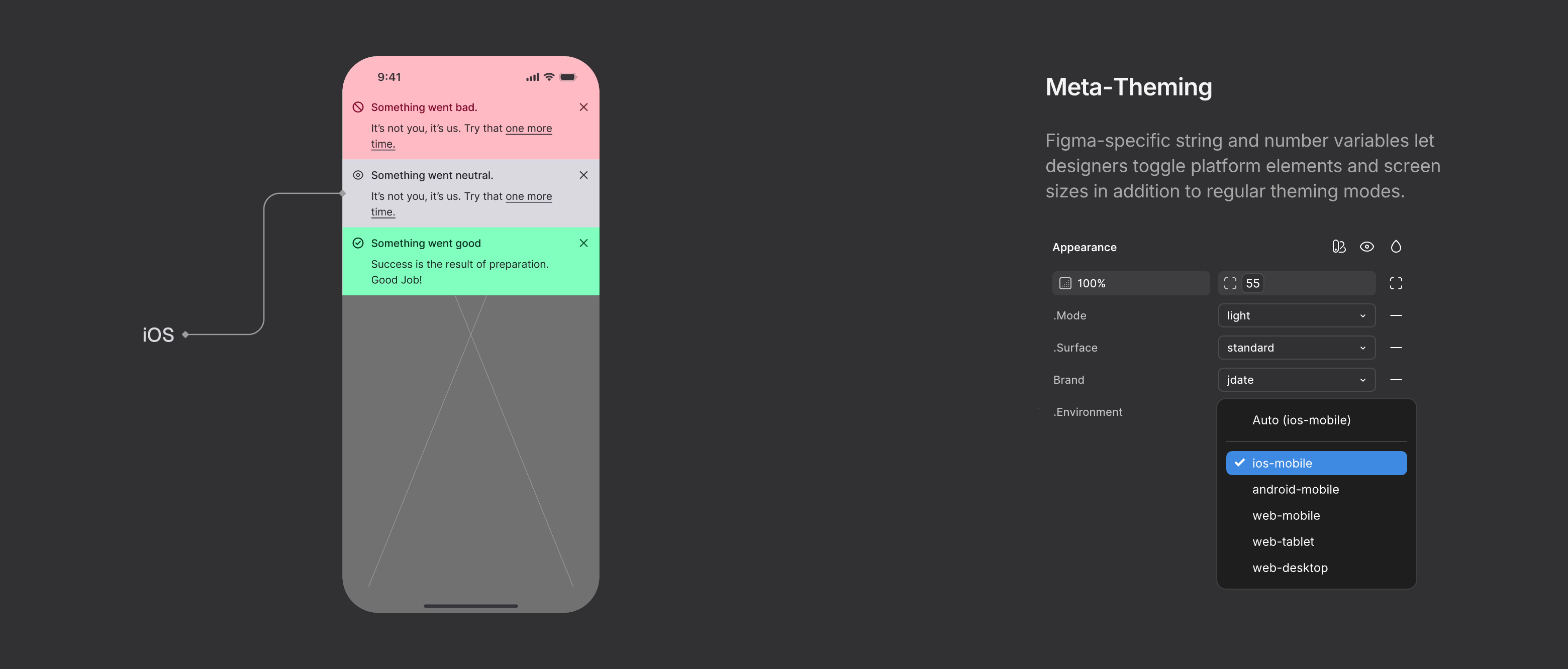
Meta-theming³ in Figma: experimental modes let designers toggle between brands, platforms, and screen sizes in a single file, swapping UI patterns, breakpoints, surface contexts, and theming instantly.
Why it matters: these outcomes gave designers a cleaner, faster environment immediately, while hinting at the efficiencies Flint could unlock in the future.
- A term I've coined, “meta-theming” refers to utilizing Figma modes to control the design environment itself, letting designers simulate context such as platform, screen size, and UI chrome through Figma-only variables.
Leaving a Blueprint Behind
The pilot program delivered tangible evidence that established Flint’s foundations and gave Spark confidence to move forward.
Validated scalability: The token model and theming pipeline worked across brands and platforms.
Established standards: Shared conventions for tokens, components, and documentation created a strong baseline for adoption.
Leadership confidence: Clear evidence to proceed into Beta with a defined path forward.
Flint is already shaping the way Spark designs and builds—clarifying structure, improving workflows, and bringing design and development into closer alignment. The work has delivered immediate value while preparing the organization for scalable, multi-brand design and delivery. It’s a foundational blueprint built for incremental adoption and ready to extend consistently across web, iOS, and Android when the time is right.
“... we’ve shed tremendous design debt with each release. We can design faster and with a better structure than we’ve ever had before.”
The Aftermath
Reflecting on this architecture-first validation effort, several takeaways emerged that would inform how I approach future design systems:
Scoped execution enables parallel validation – The pilot demonstrated that architecture and infrastructure can be validated in tandem with usable components, but this only worked because of the scoped, production-minded execution. A future iteration could test more complex patterns like data-rich cards or nested flows to validate edge cases earlier.
System maturity requires team maturity – With engineers new to design system work, early pairing and cross-functional rituals weren’t just helpful, they were essential. Future rollouts would benefit from onboarding touchpoints embedded earlier in the project timeline, especially around token semantics, API contracts, and adoption strategies.
Documentation can’t be backfilled – The pilot phase relied heavily on cross-team dialogue to stay aligned. While that worked at a small scale, structured documentation—particularly around token intent and usage—should precede scale. Investing early in naming standards, anatomy models, and contribution guidance will prevent misalignment later.
Infrastructure isn’t support—it’s strategy – Token structure, Style Dictionary pipeline, Code Connect integration, and cross-platform alignment weren’t just delivery tools but core architectural decisions. Effective design systems should frame tooling and workflows as foundational architecture with intentional design, not operational overhead.
My engagement at Spark concluded with the Flint design system positioned for its next chapter: a validated architecture and a proven model for building a scalable design system across multiple platforms and brands. Flint’s future was now just a matter of momentum.