CS1
/ CASE STUDYUplift Design System
Creating harmony between design components and front-end development best practices for scalable and seamless integration.
Introduction
Propel, our agency’s flagship product, is a reference architecture built on Salesforce Commerce Cloud that accelerates projects by packaging common integrations with improved UX. Uplift is the white-label design system that powers Propel’s front end, specifically designed for our agency’s commerce projects. Distinct from brand-focused design systems, Uplift’s goal is to quickly and accurately skin the UI with client styles, offering the complexity and flexibility needed to meet diverse business requirements.
This case study explores the specifics of the Uplift Design System.
For a deeper look at the approach, and the foundational steps and strategies, see the companion case study Design System Evolution.
My Role
I led the strategic vision and implementation of Uplift as the design system architect. I also acted as a staff designer, hands-on in creating and refining components. I collaborated with a tech lead, lead front-end developer, and supporting developers, while working closely with the design team for input and support. At a higher level, I partnered with the VP of Product, the Dir. of Engineering, and the project manager to keep the project on track and within scope. Additionally, I oversaw the comprehensive documentation of the design system to ensure transparency and facilitate training and onboarding.
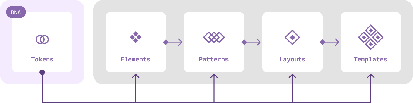
Atomic Design Revisited
To create a more dynamic and adaptable design system, we transitioned from the established Atomic Design paradigm. Brad Frost had recently updated his original Atomic Design concept to include design tokens as subatomic particles. However, the new version didn’t fully integrate design tokens into the chemistry metaphor. In addition, our team believed that tokens should inform components, patterns, templates, and pages independently.
This led me to envision tokens as the DNA of our system, shaping and informing the characteristics, behaviors, and visual attributes of our interconnected components. We began referring to this new paradigm as Organic Design. It’s an abstract model that aligns tokens seamlessly with the structural hierarchy of components, mirroring the informational role that DNA plays in living organisms.¹
- By agreeing on the naming and structure with developers early on, I was able to facilitate API alignment across disciplines and tools later on.
- Elements – Simple, small, indivisible components, akin to basic HTML elements.
- Patterns – Composite components such as cards, modals, and menus that can contain other patterns and elements.
- Layouts – Sections or blocks made up of elements and patterns.
- Templates – Screens and pages consisting of layouts.
Design Token Architecture
From Generic to Specific
In developing our UI-Kit for white-label projects, our team had explored the pros and cons of having two versus three levels of design tokens, and concluded that a three-tier architecture would best meet our needs. This structure distinguishes Uplift from standard brand-focused design systems and provides the flexibility required for our unique context.
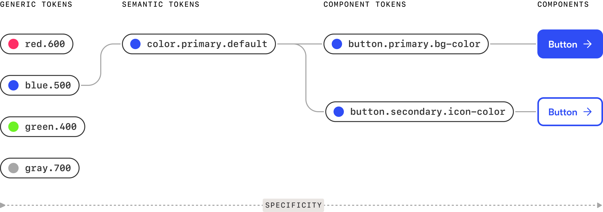
We adopted the following classification for our three-tier token architecture:
Generic Tokens – These limited sets of “option” tokens operate at the brand level, offering multi-brand flexibility.
Semantic Tokens – This layer contains all the pre-defined decisions to kickstart projects, while still allowing designers to reassign for robust flexibility.
Component Tokens – This layer caters specifically to developers, ensuring precise implementation.
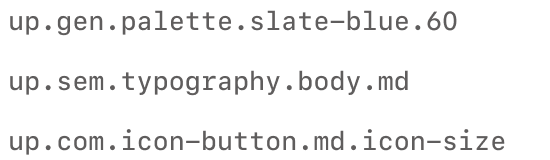
By establishing this architecture and a clear taxonomy, we achieved a shared understanding of token classification. This approach provided a scalable, predictable naming convention² for future consumers, ensuring consistency and ease of use across our projects.
-
These specific level names were abbreviated to the first three letters – gen, sem, com – preceded by the namespace "up" (short for Uplift), creating a space-efficient format for our tokens.
Seamless Design-to-Code
Our token transformation workflow begins in Figma, where design tokens are managed using the Tokens Studio plugin. These tokens are then pushed to GitHub, where they are processed by Style Dictionary to ensure consistency and compatibility. Finally, the tokens are integrated into the codebase, enabling a seamless transition from design to development.
Theming
Early in the development process, I explored the ability to theme our components, starting with background colors³. I ensured that the semantic naming of these colors made sense and functioned across multiple themes, like switching from light to dark mode. Effective theming can feel like magic, but it requires careful attention to contrast ratios for various foreground and background combinations to maintain accessibility.
- Beyond colors, I adopted theming for other variable dimensions, such as typography and responsive overrides.

Crafting the Building Blocks
The Widget Archetype
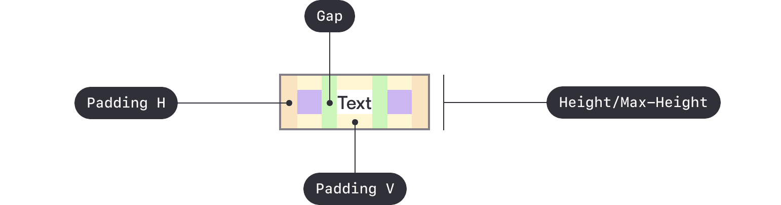
We began by working on the essential components that other components depend on, starting with a component archetype. An archetype serves as the original pattern from which all similar components are derived, acting as a template for constructing common components within the system. In our case, this would help us with standardizing size and density options across the system.
Developing the archetype was an exercise in abstraction. The guidelines defined through the archetype laid the foundation for all our buttons and input fields. Components of the same size aligned perfectly when used side by side, using consistent visual attributes for spacing, padding, icon weight, and typography.
Variable Units
During this stage (and beyond) I paid close attention to the sizing of elements, particularly concerning accessibility. We had defined which sizing and spacing tokens needed to be text-based versus pixel-based, using variable units as needed. Recognizing that users with accessibility needs often override text sizes through browser or device settings, I ensured all text was rem-based, allowing for easy adjustment while keeping the padding in our elemental components pixel-based to maintain consistent proportions and prevent components from expanding disproportionately, avoiding a “ballooning” effect.
I applied this principle to other components. For example, global margins and column gutters had to be pixel-based so that text resizing did not disrupt the layouts, causing excessive wrapping or scrolling. Similarly, the border thickness of buttons was pixel-based, while the size and weight of the icons in buttons had to be rem-based to scale proportionally with the size of the button label.
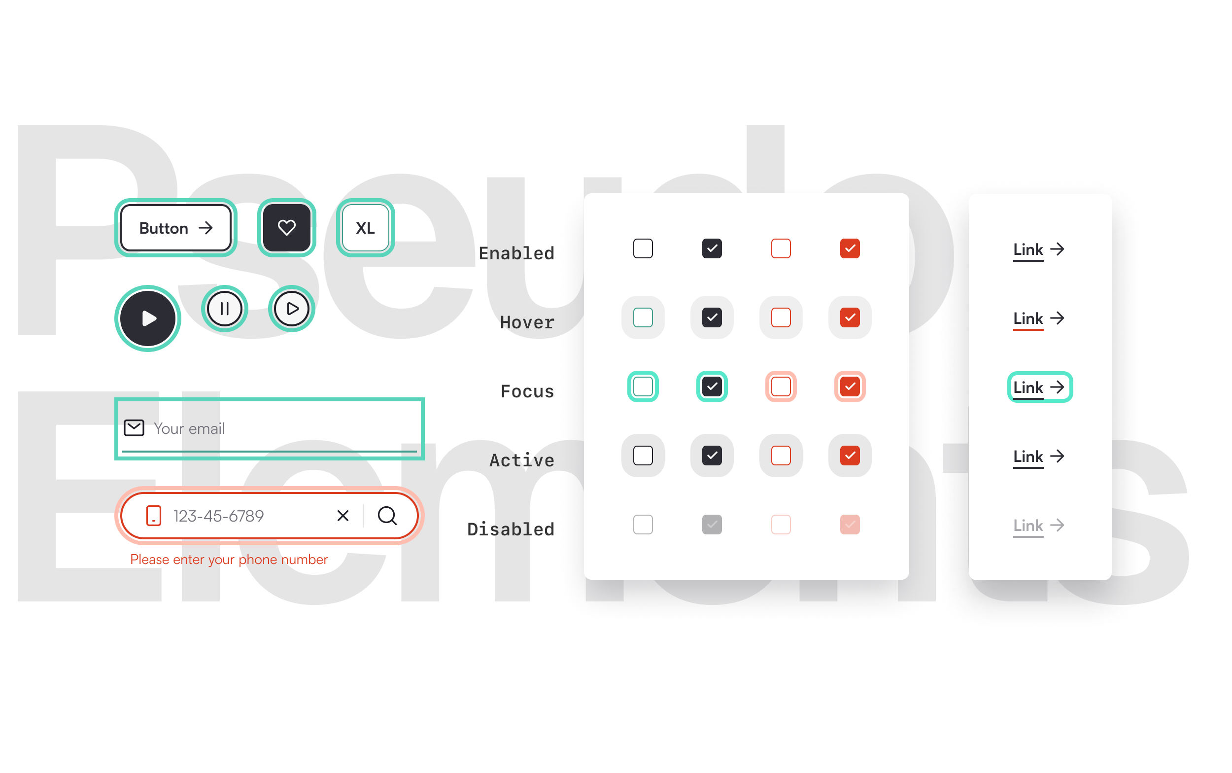
Configurability vs Composability
In building components, I’ve always aimed to strike a balance between configurability and composability. A component should not be overly complex⁴ in its configuration options, nor should it require user instructions. Consequently, some of our advanced components needed to be composable rather than overloaded with configuration options.
By analyzing the different use cases for each component and paying attention to when and where designers detach them, I provided the necessary composable mechanics in select components. This allowed designers to populate instances with their custom content as needed, while keeping our advanced components flexible, maintainable, and closely aligned with the underlying code.
- Too many properties can also make components brittle and and increasingly disconnected from the code over time.
API Alignment
To facilitate seamless translation of design decisions into code, the developers and I established a collaborative workflow centered on API alignment across Figma, code, and documentation. Through weekly sessions, we synchronized component structures, creating a shared language that enabled consistency in component properties and behaviors. We used a design-first approach to explore and ideate on components, followed by a code-first approach to ensure alignment between the Figma components and the code structure.

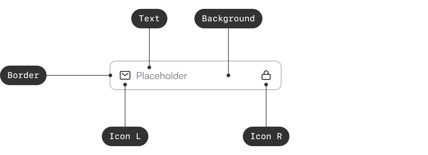
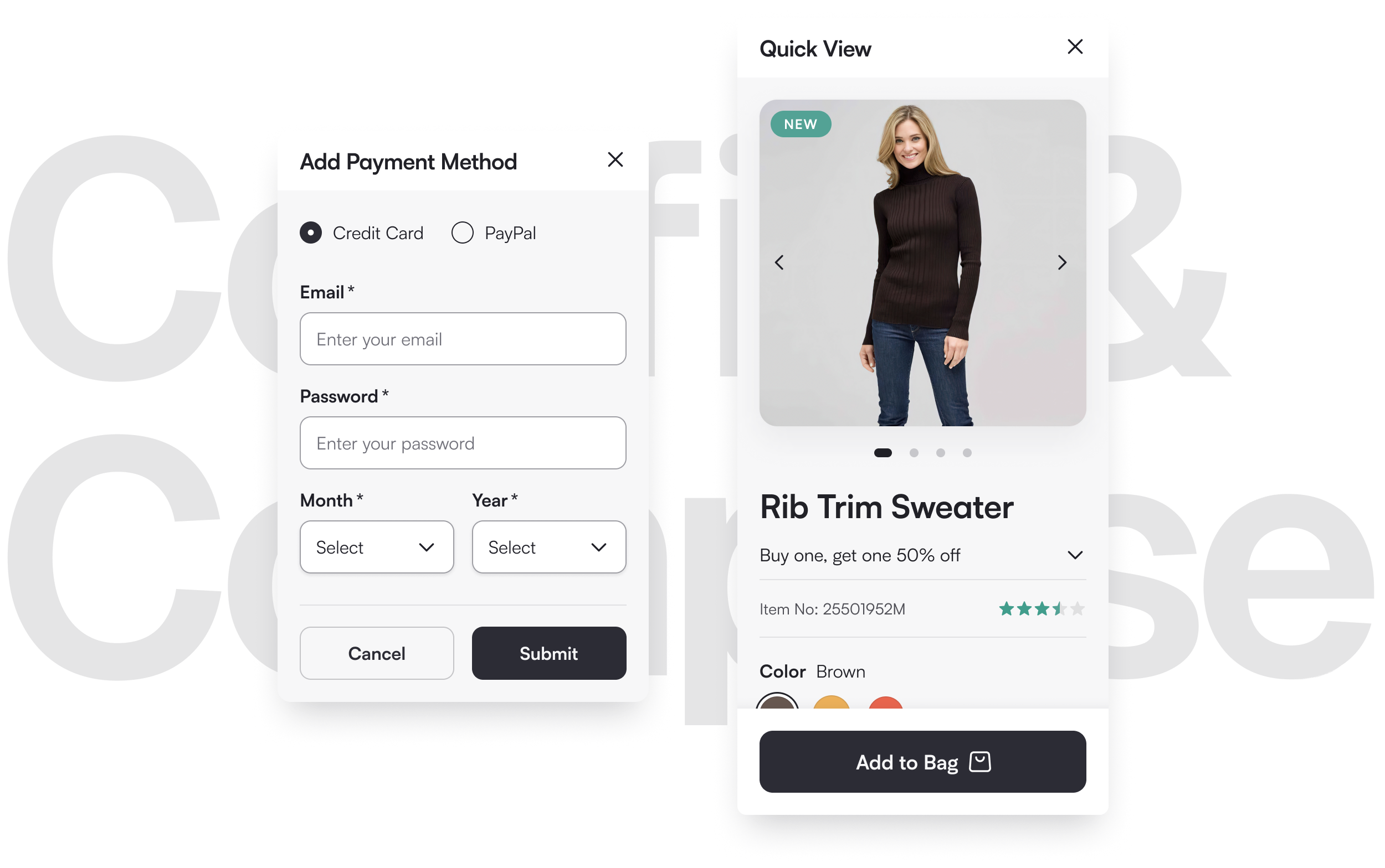
A practical example of this API alignment is our Form Group component.
To align more closely with its coded counterpart, I refactored our existing input component in Figma by splitting it into a nested architecture.
The core of the component is the input element, nested within a wrapper that includes the label, tooltip, helper text, and error text.
Decoupling the input from the wrapper makes it versatile, allowing it to be reused in different contexts without the surrounding elements.
This structure also keeps the associated tokens semantic, standard, and flexible.
This collaborative, iterative approach allowed me to structure new components and refactor existing ones to closely match their coded counterparts and align with front-end development best practices. While achieving a perfect 1:1 match wasn’t always feasible, minimizing the gap between design and code as much as possible became our ongoing focus moving forward. Drafting the API early proved crucial for creating a shared foundation, which improved collaboration between designers and developers in future iterations.
Examples
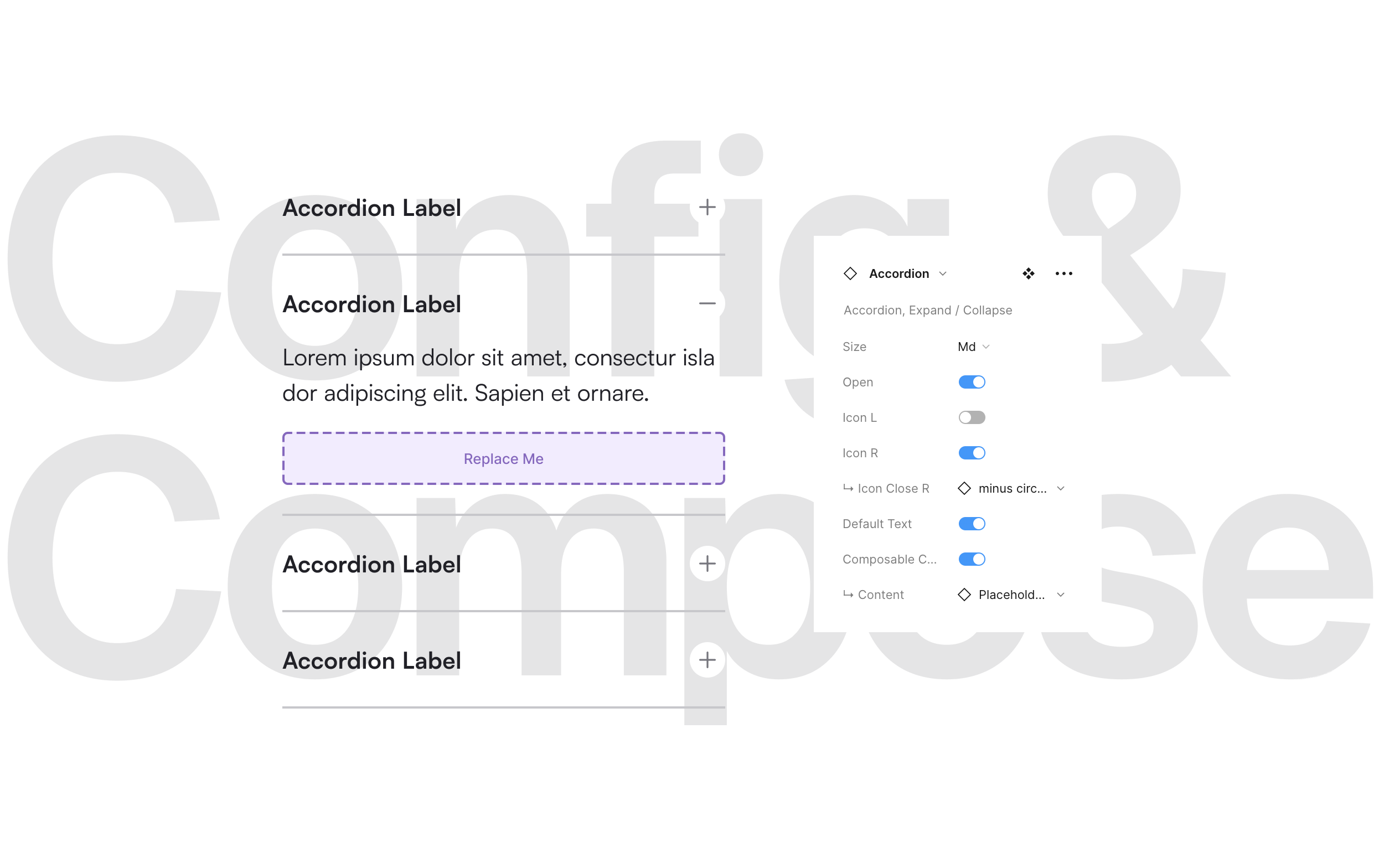
The Accordion Component is a prime example of composability. Default content satisfies 80% of use cases, while a placeholder element allows for easy customization with local components.
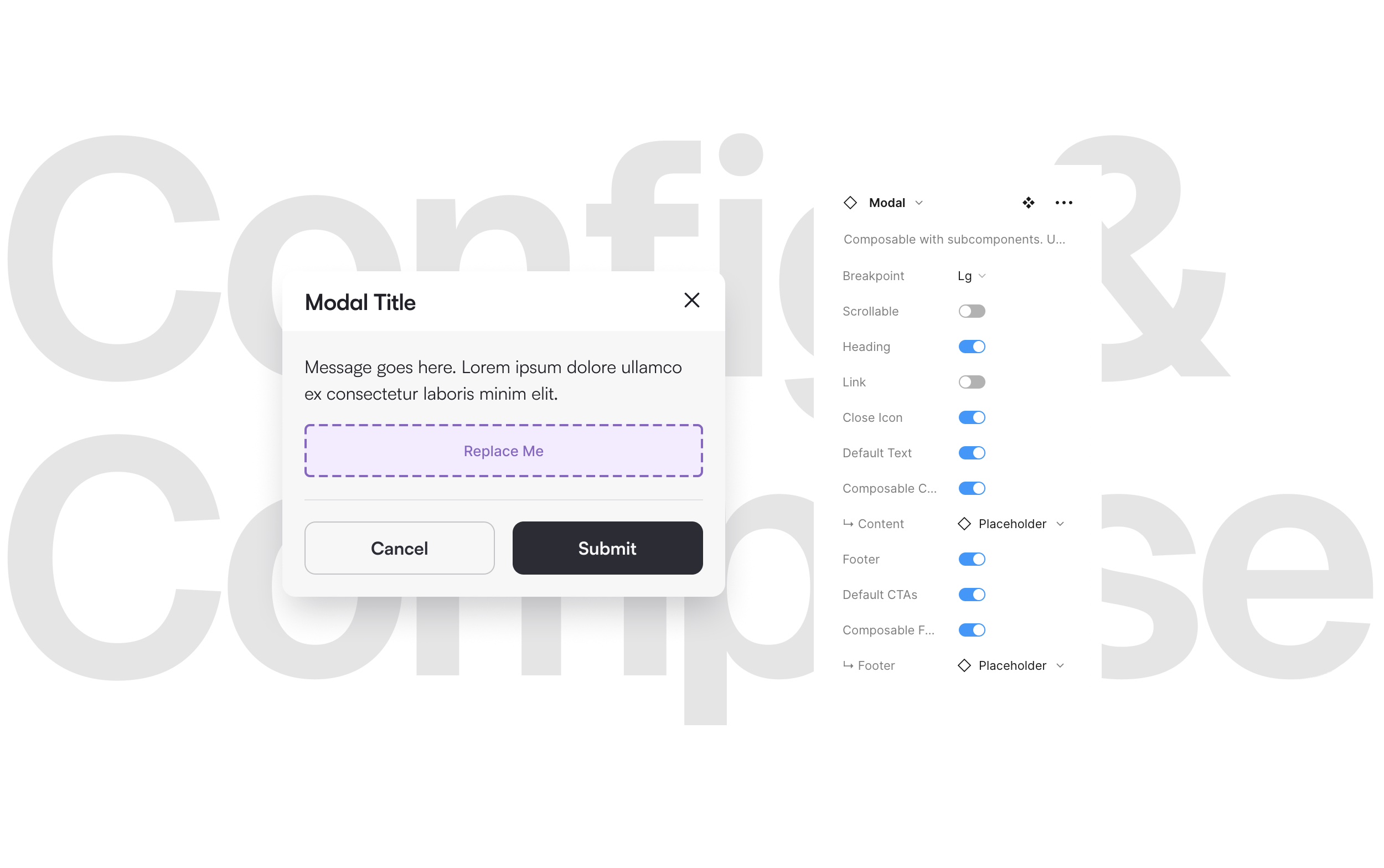
Another example of composability is the Modal Component. It includes props that meet 80% of typical content needs, while also allowing designers to easily insert custom content by replacing the nested placeholders with local components.
For modals, l included a prop that makes them scrollable. By default, the height adjusts automatically based on the nested content. However, enabling the “scrollable” prop allows the designer to control the height, while setting overflow to vertical scrolling in prototype settings.
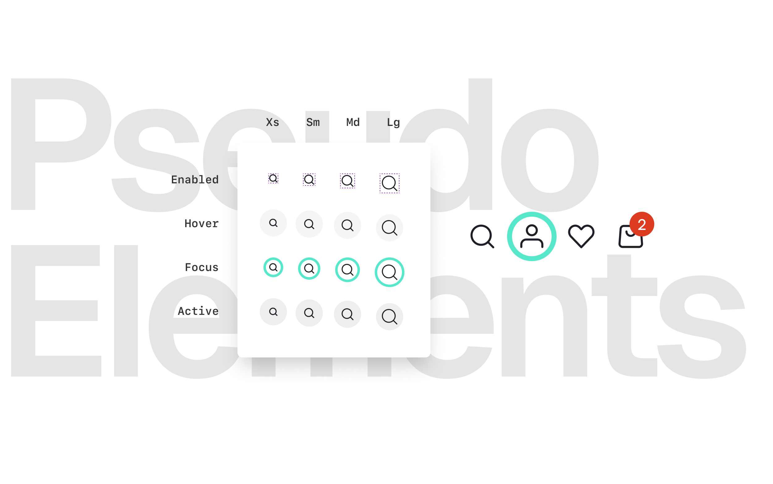
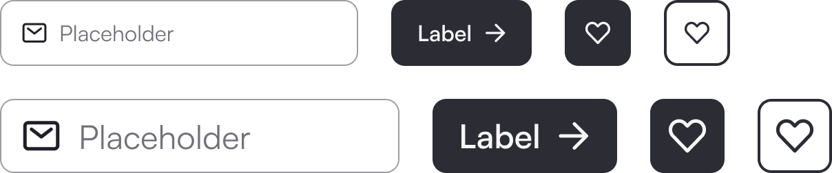
The Icon Button exemplifies our code-first approach. Each icon has a 44px target area, using state layers to simulate CSS pseudo-elements. That way, not only the icons have accessible states, but they don't have to take up that much space in a layout. Their effective boundaries remain as the size of the icon.
I used a similar technique to create pseudo shapes for focus, adding a tokenizable gap between the focus ring and its parent, enhancing contrast for accessibility. This method also allowed me to control the size, distance, and thickness of underlines and state layers in selectors.
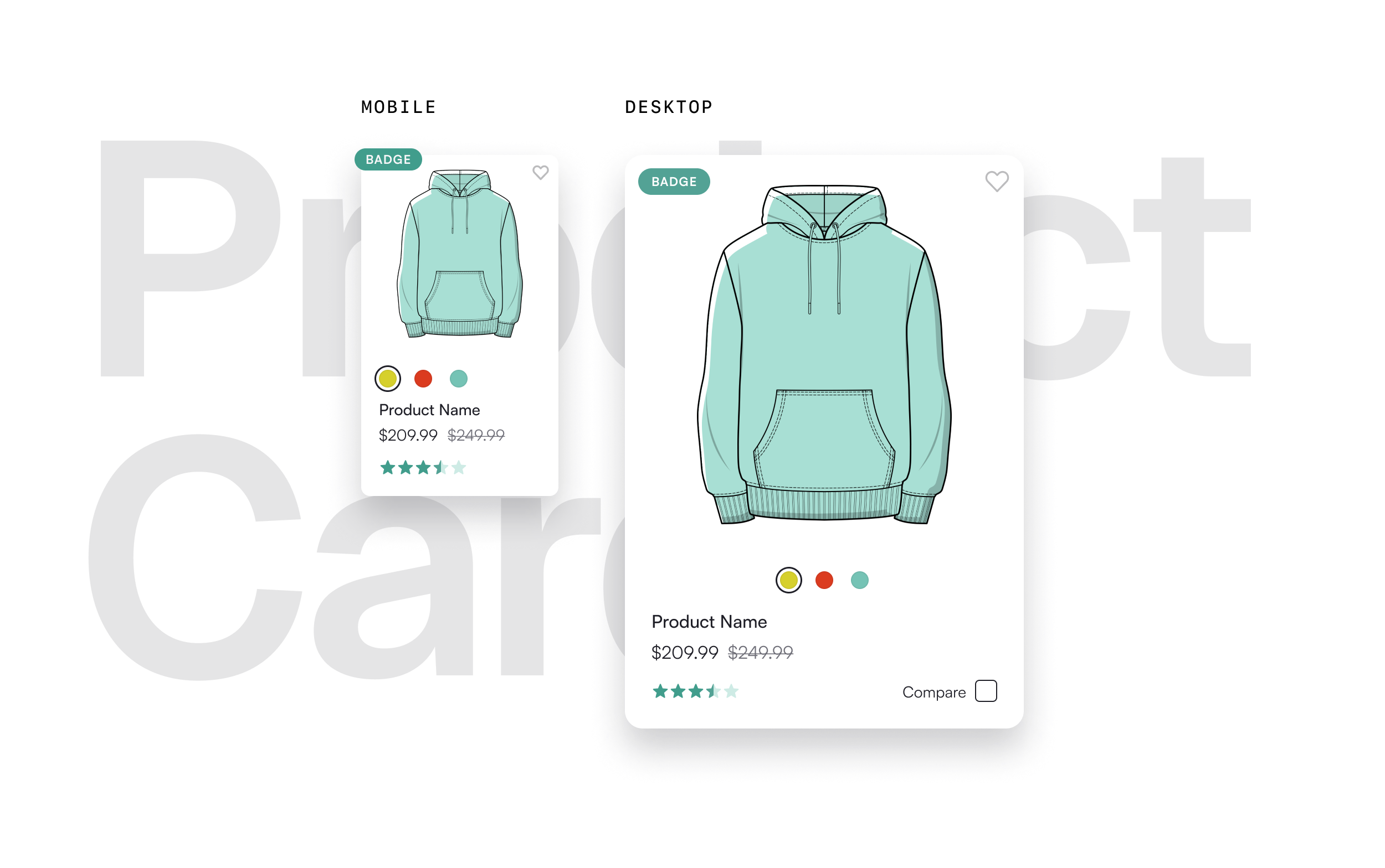
Product Cards have straightforward layouts, but tokenizing nested elements like the badge and wishlist icon was challenging. We enabled designers to fully control their offset via tokens, including negative values, which required some creative hacks to achieve in Figma.
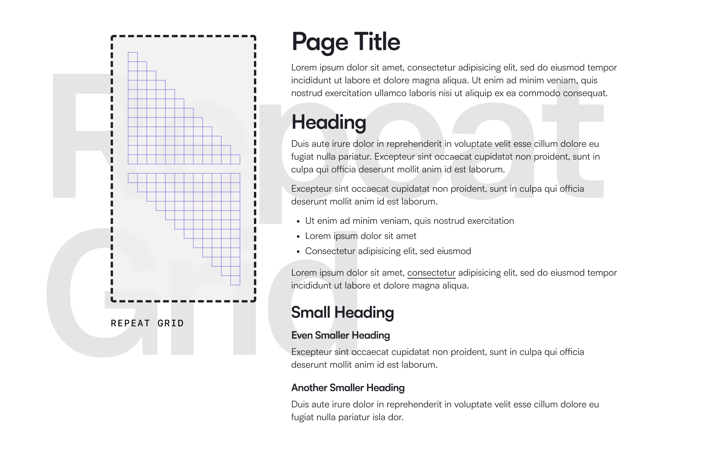
A repeat grid is a UI design feature that streamlines the creation of repeating elements. We used it for componentized text elements, enabling designers to easily compose long-form copy by stacking, while ensuring consistent paragraph spacing and heading margins.
Onward & Upward
A design system is more than a static set of guidelines or a pattern library; it’s a dynamic product, a service, and a community. As a product, the Uplift design system is designed to be a product for products, continuously evolving to meet the needs of various projects and teams. It requires the dedicated focus of a central team, but also thrives on contributions from distributed feature teams, ensuring it remains relevant and comprehensive.
The Uplift design system is primarily maintained by a centralized team. When project team designers start working on a new commerce site and encounter a component or UX pattern that isn’t defined in the design system, they reach out to the team to make a contribution. They are encouraged to submit a contribution ticket using an intake form⁵, which helps the DS team understand the problem, the stakeholders involved, and the expectations of the contributors.
Contributions are classified by the DS team as Small, Medium, or Large. Small contributions involve design tweaks or functional fixes to existing components and are handled as enhancement tickets, syncing to our Jira board for tracking. The DS team meets weekly to groom contribution tickets and provide updates. Medium and Large contributions involve bigger changes or the creation of new components. For these, we create an idea ticket in our DS roadmap and schedule a kick-off meeting with the submitting team to agree on the scope, discuss team involvement, and confirm timelines. This structured process ensures that Uplift evolves continuously while maintaining consistency and meeting the needs of the systems direct consumers.

- Contributors are required to navigate a decision chart on the intake form before unleashing their ideas. 😄
Keeping Uplift Alive
Documenting for Consistency
The documentation for the Uplift design system covered all standard aspects, including the anatomy, properties, and variants of each component. Diagrams and descriptions clearly illustrate the structure and function of components. Additionally, the documentation highlights the interdependencies between components, showing how they nest within each other. Using agreed-upon technical terminology and vocabulary, this approach provides a clear understanding of each component’s functionality, supports training and onboarding, and facilitates collaboration across design and development teams.

“Onur has been key in getting alignment on process documentation, and functionality across the technical, UX, and product teams, especially as it relates to Propel. His patience and persistence as a leader have helped make major progress.”