Why Letter Spacing Should Be Parametric
A calculated approach to optical precision and consistency.
—
Letter spacing adjusts more than just the gap between characters. It changes how text feels and reads. Get it right, and words breathe naturally. If the spacing is off, the type can feel unbalanced or uneasy; too loose, too tight, or simply out of tune with the typeface itself.
The challenge isn’t finding the perfect spacing for one size. It’s maintaining appropriate spacing across all sizes in a type system.
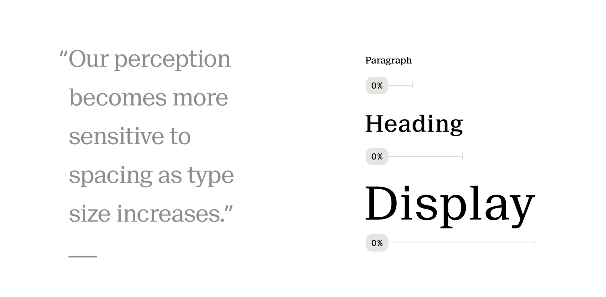
The spacing that works at 16px body text starts to feel loose and unfocused at display sizes. Large letters naturally carry more internal white space, and our perception becomes more sensitive to spacing as type grows. This isn’t preference – it’s optics. Most designers handle this by adjusting large sizes manually. But in design systems, manual adjustments don’t scale across teams or themes.
We need a formula that adjusts letter spacing parametrically as type scales.
letterSpacing = basePercent × fontSize × (fontSize / 16) ^ curve
The calculation uses two adjustable variables:
basePercentis the spacing you want for 16px font, expressed as a decimal relative to the font size. e.g., if you want 0.4px at 16px (2.5%), use 0.025.curvedefines how spacing behaves as the font size increases. A curve of 0 keeps the percentage constant across all sizes. Higher values increase spacing more aggressively as type grows. And negative values work the same way, but in the opposite direction.
With these two variables, you can model the natural compression that type needs without hard-coding values for every heading level. If you’re using Tokens Studio, you can set basePercent and curve as variables, then use math expressions to generate spacing tokens across your entire type scale. Change either variable, and every heading updates instantly.
This approach is highly effective when working with multiple brands or type families. A geometric sans with tight counters might benefit from closer spacing than a humanist serif with open forms and varied stroke contrast. By adjusting just two variables, you get consistent optical spacing that adapts as type scales. The goal isn’t mathematical perfection; it’s typographic precision without guesswork or constant tuning.
Update – 2025 07 12
The formula works perfectly when you’re working with negative letter spacing. It scales cleanly as type size increases, tightening spacing gradually. But what if you want to start with positive spacing at 16px? Something more open and airy at body size, but that still gradually collapses – eventually crossing into negative values at larger display sizes.
To make this work, I’ve added an offset variable. It compensates for the formula’s requirement of a negative base value. The offset is a fixed pixel override that shifts the entire curve up or down. By keeping the base
(to preserve the tightening behavior), you can use a positive offset to start more open at smaller sizes.
With this edit, the full formula became:
letterSpacing = base × size × (size / 16) ^ curve + offset
This gives you complete control over both the curve’s shape and the position of all calculated values.